 Home
Home Products
 Exclusive Items
 Support
 WhatsApp Group
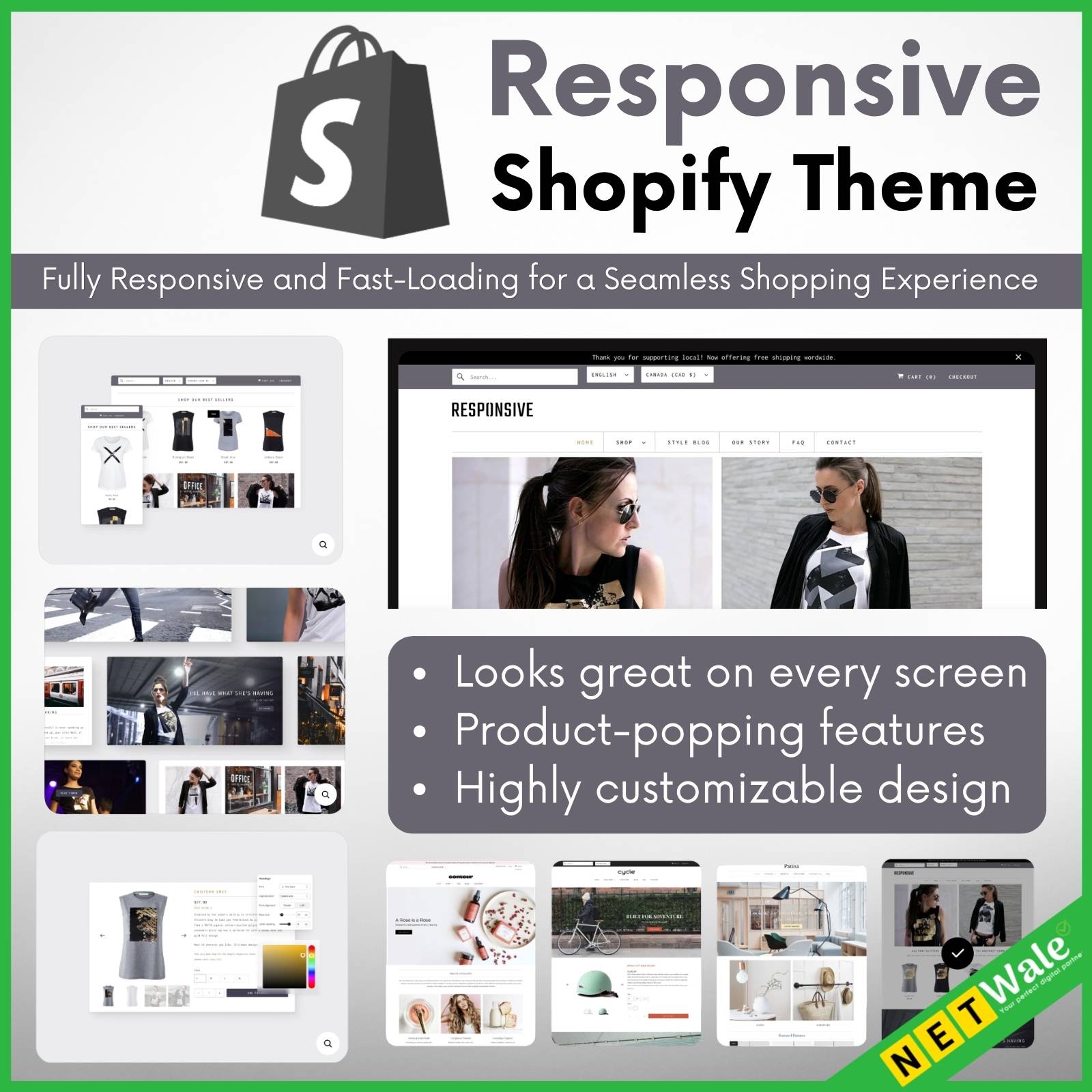


Fully responsive and fast-loading for a seamless shopping experience
Looks great on every screen
Responsive is a flexible theme designed to look sharp across all devices. Help your customers shop easily and quickly, wherever they are.
Product-popping features
Responsive has a wide layout that’s ideal for full product imagery, plus features like image zoom, hero videos, promo banners and more.
Highly customizable design
Various options for layout, typography, and featured promotions will help you tell your brand’s story exactly how you want.
Features
Cart and checkout
- In-store pickups
- Pre-order
- Quick buy
- Slide-out cart
Marketing and conversion
- Age verifier
- Back-in-stock alert
- EU translations (EN, FR, IT, DE, ES)
- FAQ page
- In-menu promos
- Product badges
- Quick view
- Recommended products
- Stock counter
Merchandising
- High-resolution images
- Image galleries
- Image rollover
- Product tabs
- Size chart
- Slideshow
Product discovery
- Breadcrumbs
- Enhanced search
- Mega menu
- Product filtering and sorting
- Recommended products
- Sticky header
Presets
Responsive comes with 4 ready-made designs for your store
Related products
-83%

Original price was: ₹3,000.00.₹499.00Current price is: ₹499.00.
-99%

Original price was: ₹100,000.00.₹1,500.00Current price is: ₹1,500.00.
-90%

Original price was: ₹4,999.00.₹499.00Current price is: ₹499.00.
-99%

Original price was: ₹50,000.00.₹499.00Current price is: ₹499.00.
-90%

Original price was: ₹5,000.00.₹499.00Current price is: ₹499.00.
-99%

Original price was: ₹50,000.00.₹499.00Current price is: ₹499.00.
-67%

Original price was: ₹1,530.00.₹499.00Current price is: ₹499.00.
-90%

Original price was: ₹5,000.00.₹499.00Current price is: ₹499.00.